It isn’t a complete list of my work, just the projects that stuck with
me the most. Projects before 2017 were from Usethics, where I was an art
director, so not everything shown here was designed entirely — from
start to finish — by me.
NB Some of the smaller projects are only on Behance.
Noda
2023-2025
Noda is a payment processor with barely any visible interface. But the simplicity is deceptive. Noda operates in Open Banking—a relatively new model where users are asked to trust and understand a flow they don’t yet fully recognise or have much experience with. Every screen, every step has to feel clear, safe, and intentional as there’s no time or space to explain. So, small UI but serious UX challenge. Plus, there are merchants with their own problems to solve.
Besides nudging and polishing UX, I have redesigned a brand to be more punchy and trustworthy, initiated corresponding redesign of the payment process, and created the first version of registration/onboarding process for merchants (incl. shareholder interviews). Plus, I supported the sales team as the publication designer and, sometimes, as a copyrighter.
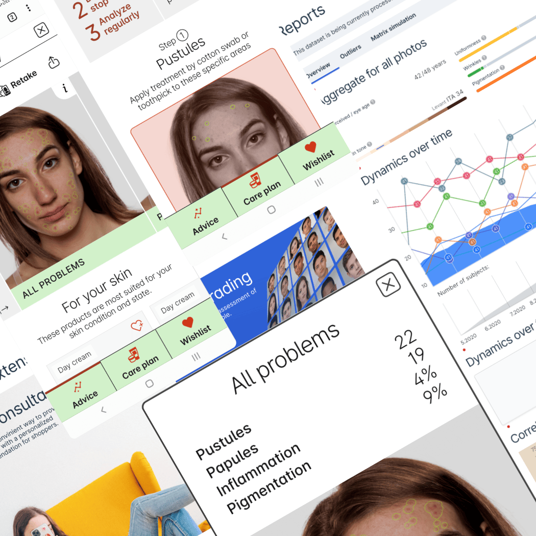
Haut.ai
2020-2022
Haut.ai builds software for skin clinics, cosmetic brands, and retail — basically anyone who needs to understand what’s going on with human skin. There, I have designed SaaS tools for clinicians and cosmetic researchers, survey apps for long-term skin and product studies and a retail web app where customers take a selfie and get tailored recommendations.
On paper, it can look like straightforward UX work — pushing pixels in Figma. In reality, the ground kept shifting: business goals, product direction, assumptions. So the real job was keeping things coherent while everything else was in motion.
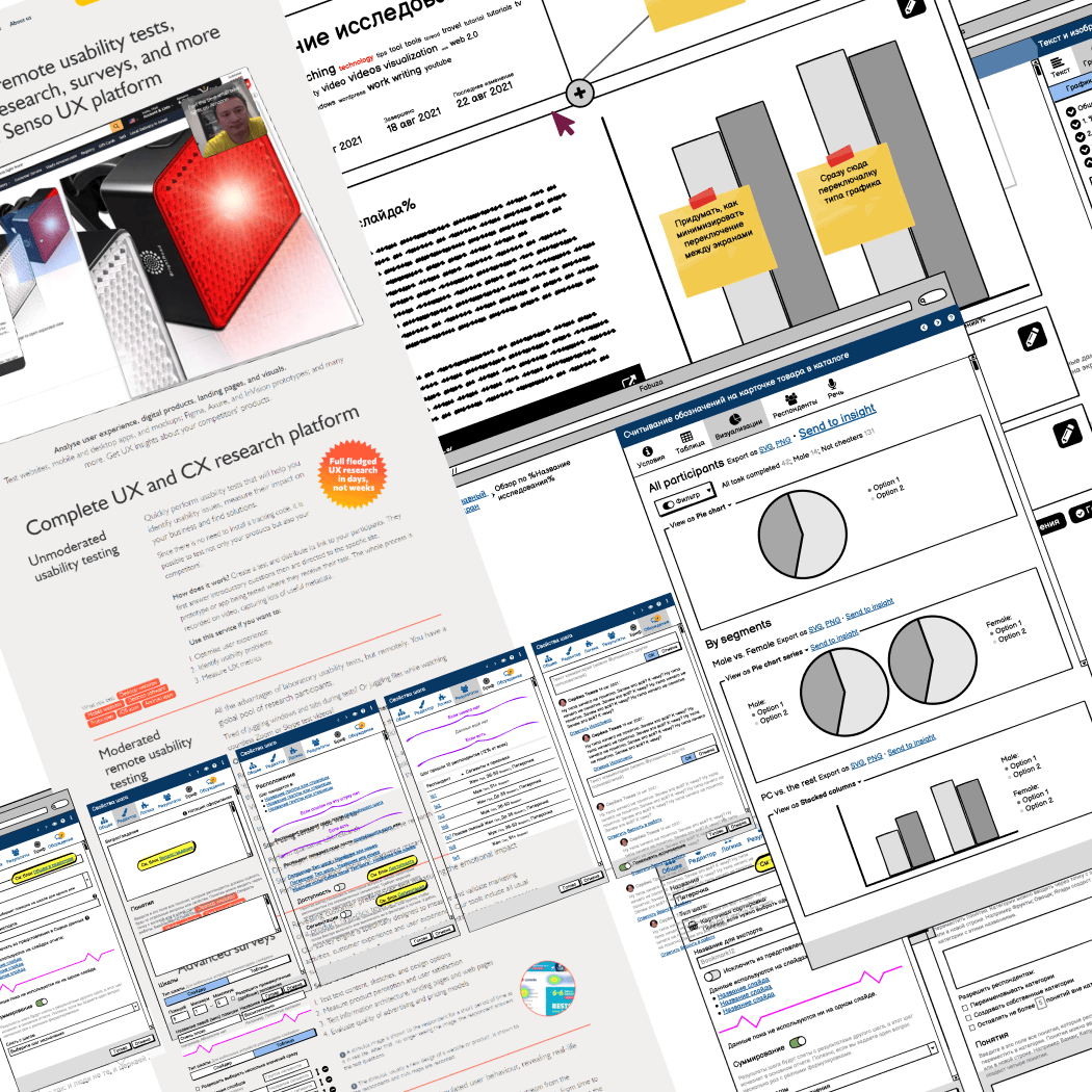
Senso Study
2019—2021
Senso Study builds a powerful platform for market and user research — powerful, but more complicated than it needed to be.
With my background running a research company, I was brought in to rethink it from the ground up: a new concept, simpler structure, better flow — something researchers and usability specialists could actually profit from using.
Along the way, I also refreshed the company’s brand, and designed (then coded and shipped) a new website — the usual “while you’re at it” scope that somehow always appears.
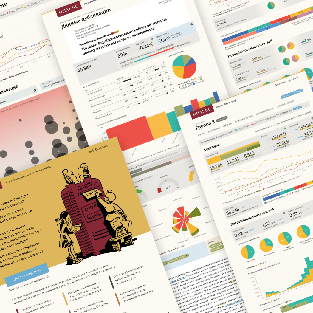
Index
2019—2020
Index.ru is a custom analytics tool for online media — built to show what actually matters: impact, reading behaviour, and more.
I joined when it was still just a proof of concept. From there, I designed the internal UI, a range of reports and visualisations, and all the graphics — including the logo and overall visual style.
The interface itself is deceptively simple: a handful of reports and a few settings pages. The challenge is the data — dense, nuanced, easy to misread. So most of the work went into getting the wording right, shaping the visualisations, and making sure everything holds together across desktop and mobile.
See more on Behance
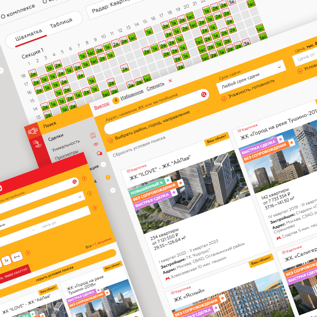
SPN24
2018—2020
SPN24 connects large housing developers with small realtors — giving one side reach, and the other inventory
What started as a quick favour (“three weeks to launch, just something small but decent”) turned into a long, productive collaboration. Working closely with the team, I tackled a few major usability issues early on, rebuilt search, and sketched out the first version of the visual style.
Since launch, I’ve designed dozens of features — printable presentations, event calendar, building editor, multiple iterations of search — while steadily refining the core flows and interfaces.
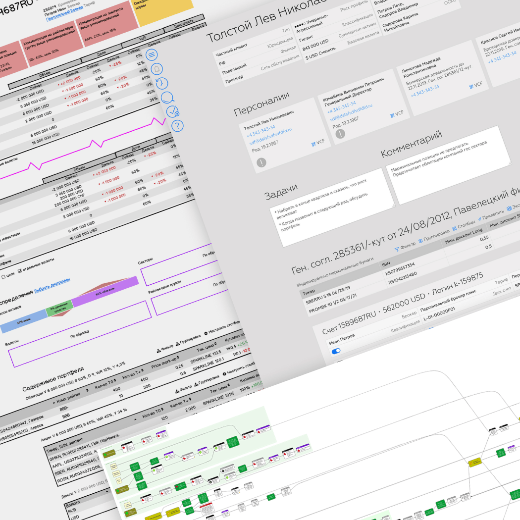
BKS
2018
Wealthy and corporate clients of BKS are handled by personal brokers who live in a constant stream of data — markets, news, clients, and compliance. In practice, that meant two large monitors and a mess of disconnected systems: mail, terminals, CRM, and internal tools.
PERSEUS was built to cut through that chaos. It pulls key data into one place, streamlines internal workflows, and surfaces the right information exactly when brokers need it — without the usual alt-tabbing gymnastics.
I worked on this together with my long-time colleague Alexey Copylove. He focused on research — interviews and mapping user activity — while I handled IA, UX, and visual design.
The timeline was tight, but the users helped: experienced, opinionated brokers who knew exactly what slowed them down. We ran quick interviews, observed real workflows, and built a solid foundation for the architecture and UI. I put together the initial prototype, and we refined it directly with the brokers. From there, I defined the UI theme and designed the navigation.
See more on Behance
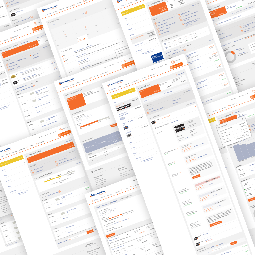
Promsvyazbank
2015—2016
When Promsvyazbank decided to overhaul its online banking, they brought us (Usethics) in — we’d previously designed their internal teller systems. We worked on both web and mobile (only the web version is shown here). The brief looked straightforward; the reality wasn’t:
● Two parallel products — standard and premium — with different feature sets and visual styles. The UI had to flex without falling apart.
● A surprisingly wide range of services, which led to designing a dedicated, dynamic menu for personalized offers.
● A loyalty program with no standalone home, which we had to integrate directly into the banking experience without turning it into a mess.
The result pushed PSB Online to the top of the “most trusted” ranking among Russian digital banks (by Markswebb).
Along the way, I’ve also designed two other banking apps for Russian banks — one of them back in the Symbian era, which now feels like archaeology.
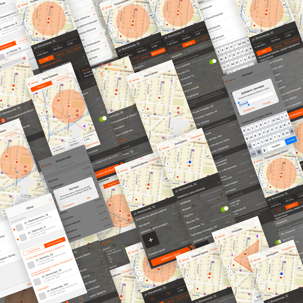
X5 Retal Group
2017
With 15,000+ stores across Russia, X5 Retail Group has a very specific problem: location. Some stores underperform simply because there aren’t enough people passing by. Others do great — but there’s no room nearby to expand. And sometimes their own stores compete with each other.
To figure this out, X5 relies on a network of retail scouts who map neighbourhoods in detail: residential density, foot traffic, nearby shops, empty spaces — all the signals that hint at a good (or bad) location.
We designed both the scout app (iPhone) and the backend analysis system. The app is where things get interesting: it had to support fast, repetitive fieldwork — marking buildings, estimating population (floors, entrances), logging competitors and points of interest — all on the go, often under less-than-ideal conditions.
The backend is more conventional analytics. The scout app isn’t — it’s tuned for speed, minimal friction, and just enough structure to make the data usable later.
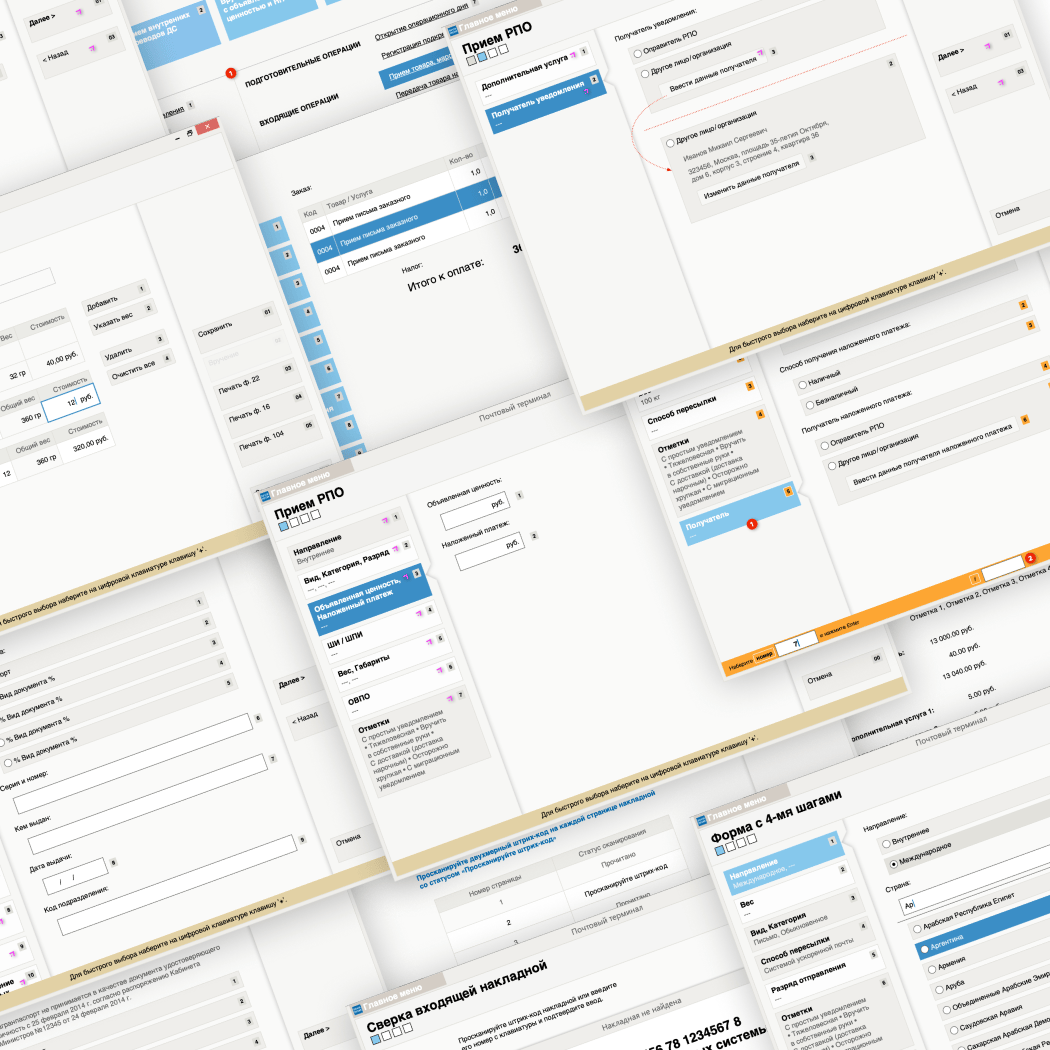
Russian Post
2016
Clerks at Russian Post handle a constant stream of parcels — all shapes, destinations, and delivery types. Rules change often, which makes static interfaces age badly. The brief was to design something fast, flexible, and easy to update without retraining everyone every few months.
The challenge: keep it adaptable without turning it into a moving target for the user. And make it fast — fast enough that a mouse starts to feel like a liability.
The solution was a rigid three-pane layout. On the left navigation + a live snapshot of the current order. On the right delivery options that update in real time (e.g. heavier parcel → fewer cheap options). And in the centre, the only interactive area. That structure keeps change contained — when backend rules shift, only a small part of the UI needs to react.
Input-wise, I went with an old-school approach: numeric shortcuts. Instead of tabbing through fields, the cashier just hits a number on the keypad to jump straight to the screen or section. It’s simple, fast, and error-prone.
I’ve designed a few operator interfaces over the years — this one ended up being the fastest in practice.
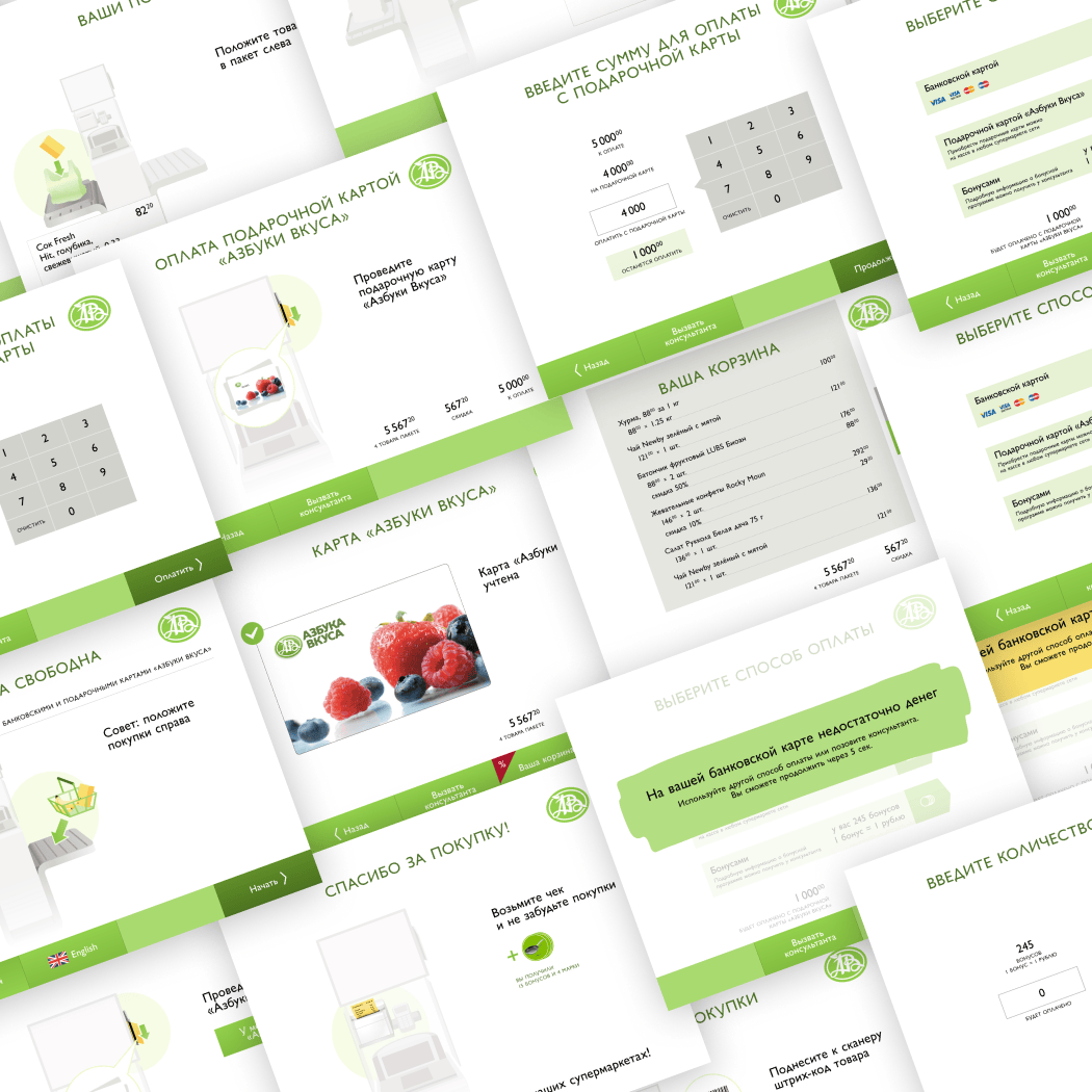
Azbuka Vkusa
2015
Azbuka Vkusa (“Alphabet of Taste” in English) is a leading upmarket food retailer in Russia. They decided to launch a chain of small deli stores with self-checkout — and asked us to design the terminals from scratch. Existing solutions didn’t make the cut.
We started the only sensible way: by trying other self-checkouts. Bought a lot of snacks. The experience was consistently bad — clunky flows, cryptic instructions, slow interactions.
Turned out, the slowness wasn’t accidental. A lot of it comes from anti-theft checks running in the background. So the real job became twofold: smooth what can be smoothed, and carefully hide what can’t.
We tested extensively — first on a rough cardboard prototype, later
on the actual machine — dialing in everything from on-screen copy to
placement of UI controls.
Unlike many of our projects, we also
handled the full visual design here, not just structure and rough
graphics.
Now the machines are installed not just in small delis, but also at regular Azbuka Vkusa stores. Last time I checked, the interface and the graphics were left largely intact, proving that the foundation was solid.
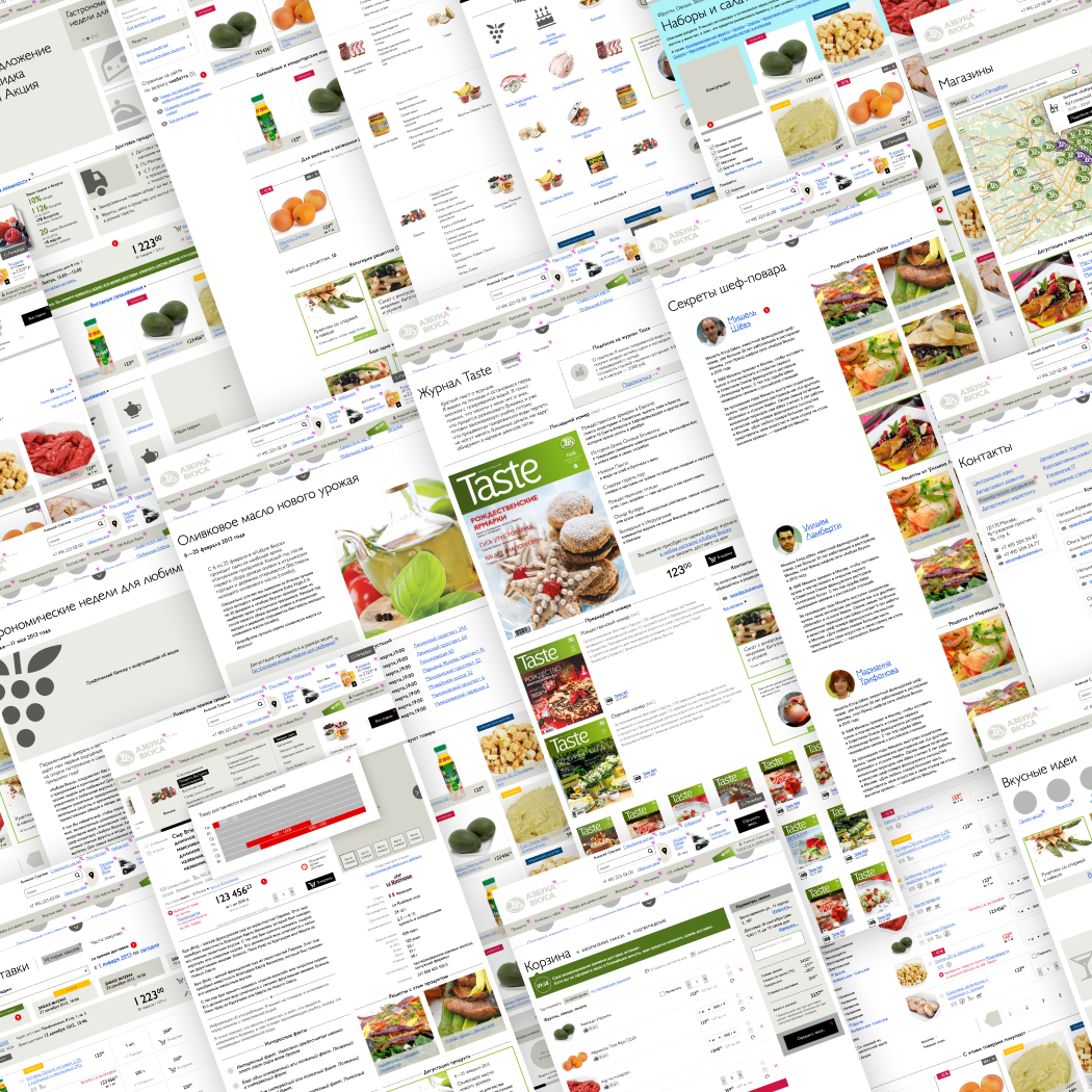
Azbuka Vkusa
2013
Azbuka Vkusa wanted to move online — which sounds routine until you remember what they actually sell: very fresh, very specific food.
That breaks the usual e-commerce logic. You’re not buying “apples,” you’re buying these apples, in this condition, deliverable within a tight window. If they won’t be good tomorrow, tomorrow simply isn’t an option — and swapping them for “similar” ones isn’t acceptable.
So the core problem wasn’t UI polish — it was rethinking the buying flow. We designed a checkout where delivery timing comes first (often before browsing), shaping everything that follows. Availability, assortment, even what the user sees — all tied to when the order can realistically arrive.
Because Azbuka Vkusa sells taste, not just groceries, we added supporting tools — like a recipe library where you can buy all ingredients in one go — and built a corporate site with the right amount of “posh” to match the brand.
I’ve worked on plenty of e-commerce projects, but this one was easily the most complex. Also, one of the more satisfying — a decade later, much of the structure is still there, just with fresher visuals.
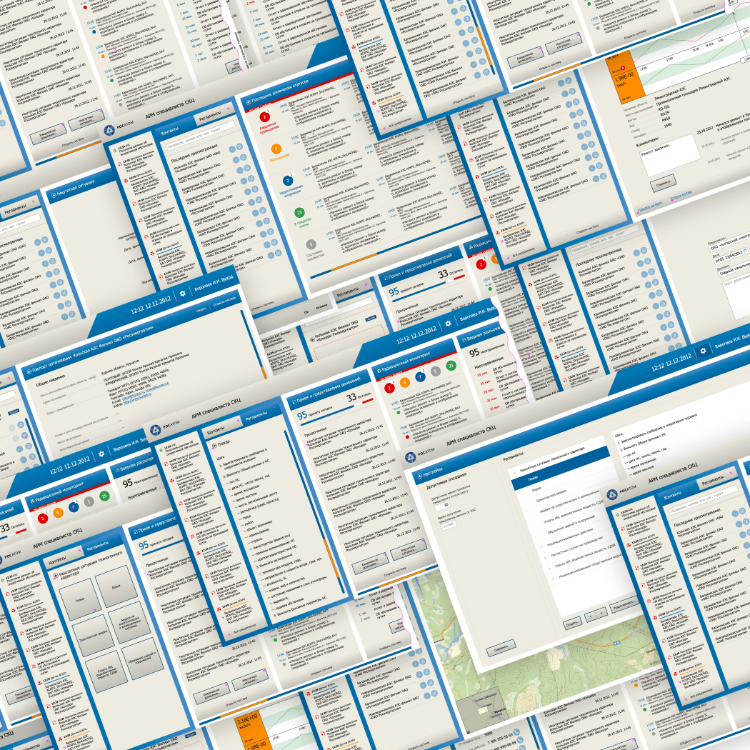
Rosatom
2012
ROSATOM State Nuclear Agency is Russia’s Ministry of Atomic stuff.
It oversees every use of radioactive substances, manages nuclear
energy production, and does a lot of related tasks. It runs a 24/7
operations centre that keeps an eye on everything from the
transportation of radioactive materials to scheduled (and impromptu)
drills.
Operators there juggle multiple systems and databases all day. The goal was to cut that fragmentation and provide them with a single interface for the tasks they perform most often.
I have designed three systems in total, including a real-time monitoring dashboard. The core idea was a wide, horizontally scrollable workspace made of panes: each pulling in key data from different sources. Some are read-only, others support heavy interaction (like a built-in phone directory).
It’s not the only dashboard I’ve worked on — but it’s the only one dealing with live data, which always adds a bit of tension to the design.
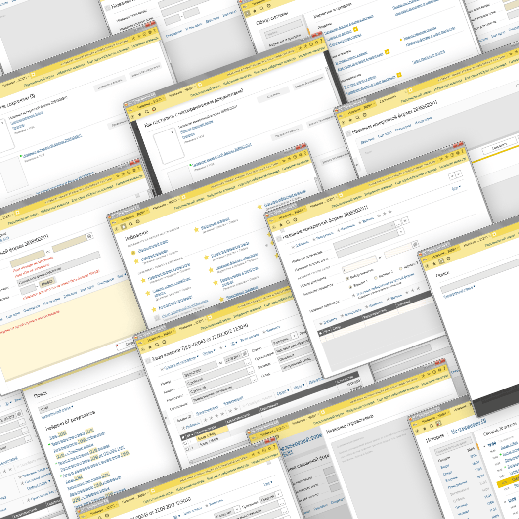
1C
2012
The 1C Platform runs hundreds of thousands of businesses in Russia and abroad — powering everything from retail to education. But its UI came from another era: a multi-window model that was clunky even on desktop and completely out of place once things moved to the browser.
After a series of successful projects with 1C, my bureau was brought in to rethink navigation from the ground up. The result became what’s now known as the TAXI UI (1C v8): simpler, more fluid, and far easier to learn.
Several designers worked in parallel, each building their own prototype in isolation. We then pushed every concept as far as it could go, solved the same set of problems multiple ways, and finally combined the strongest ideas into a single design.
Concepts like this usually get trimmed down before launch, as feasibility issues generally tend to water down the most radical solutions. This one didn’t. It went into production largely intact, with a few smart refinements from the 1C team (like moving document tabs to the bottom).
Later, I art-directed another UI concept—this time for KROK, a major Russian systems integrator—focused on a business systems constructor.
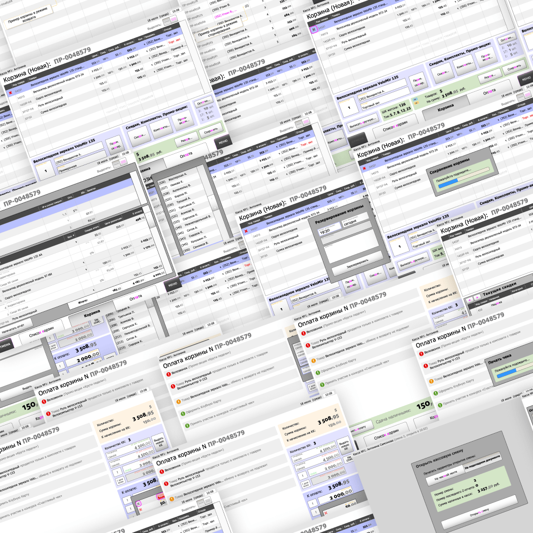
Sportmaster 2010
2023-2025
Sportmaster, Russia’s leading sports retailer, runs large-format stores with massive inventories and notoriously complex loyalty programs. To speed up checkout, they set out to build their own cashier terminals — touchscreen-based, which was still fairly new at the time.
On paper, cashier workflows are rigid: scan, total, pay. In reality, loyalty mechanics break that flow. Cashiers have to upsell (“add one more and you’ll get a discount”), handle edge cases like split payments, and juggle a surprising number of small, error-prone details.
We designed a stripped-down, highly legible UI with oversized touch targets to fit a small screen and fast-paced use. Even the typography was custom — price digits drawn in an old-style minuscule form, making them quicker to recognise at a glance.
The system proved effective enough that Sportmaster came back for a second round: a lighter, simpler version of the terminal for smaller stores, now used mostly in China.
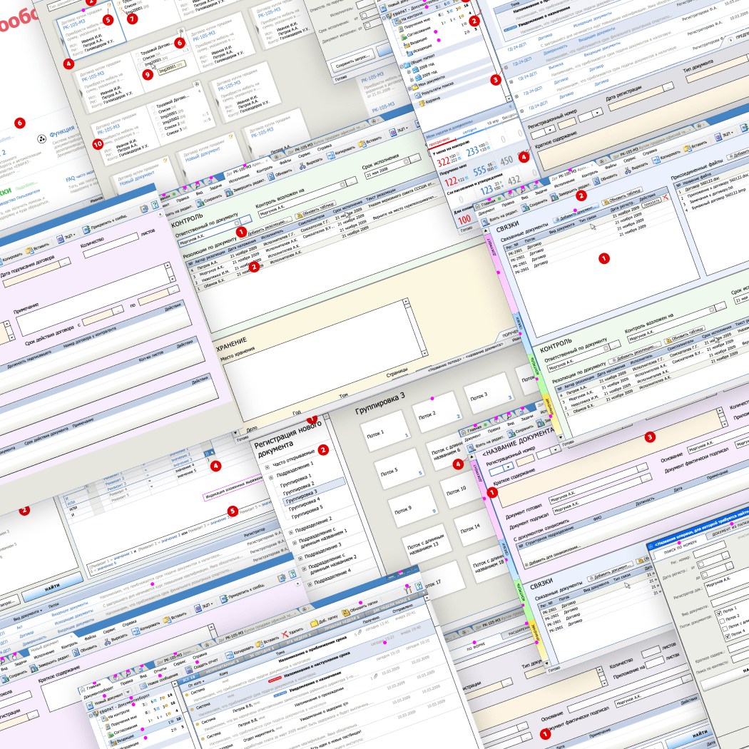
E1 Euphrates
2009
E1 Euphrates was a full-scale document management system for large, mostly government organisations. I’ve worked on plenty of enterprise tools, but this one stood out — we had carte blanche. The usual “too hard to implement” pushback (which is exactly how earlier versions ended up bloated and painful to use) was off the table.
We focused on how people actually work. Users constantly jump between related documents, so we introduced tabs (still a novelty back then), but made them smarter—automatically grouped by context to cut down on hunting and switching.
The documents themselves were long and dense, so navigation became critical. We designed a way to move quickly between sections and collapse everything that wasn’t relevant in the moment, keeping the interface focused instead of overwhelming.
History was another weak point. A flat list—like browsers still use—just didn’t cut it. So I designed a summary view where documents were grouped by tasks, giving users a clearer sense of what they were doing and why. (Years later, a similar idea showed up in Windows Timeline.)
The thinking behind this project carried over well into later work, including ConsultantPlus—a major legal and best-practices database—where I led the art direction.
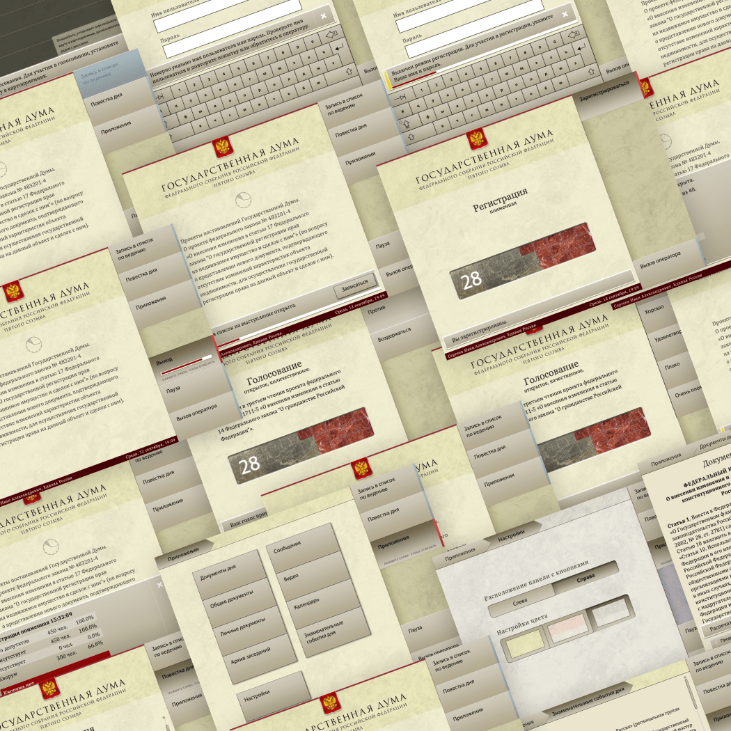
Duma of Russia
2005
Members of the Russian Parliament (Duma) vote using small screens built into their desks—and I designed the UI for those.
The constraints were… memorable. The displays were tiny, anti-vandal
touchscreens with terrible glare and colour reproduction. Input was
primitive — no gestures, just blunt presses — yet there was still a
request for “rich” visuals.
On top of that, it was a real-time system: each vote happens in a tight window, which leaves no room for hesitation. And the interface had to be self-explanatory — no onboarding, no help, no second chances.
Finally, the Russian MPs were (and are) drawn largely from the rich and thriving ecosystem of idiots, retards and philistines.
The solution was a stripped-down, highly consistent interaction model that worked within those limits instead of fighting them. Everything was tested directly on the actual hardware to make sure it held up under real conditions.
The system ran for years without issues. After it was eventually retired, the quality of laws seems to have… drifted. I’d like to think that it’s a matter of causation instead of correlation.
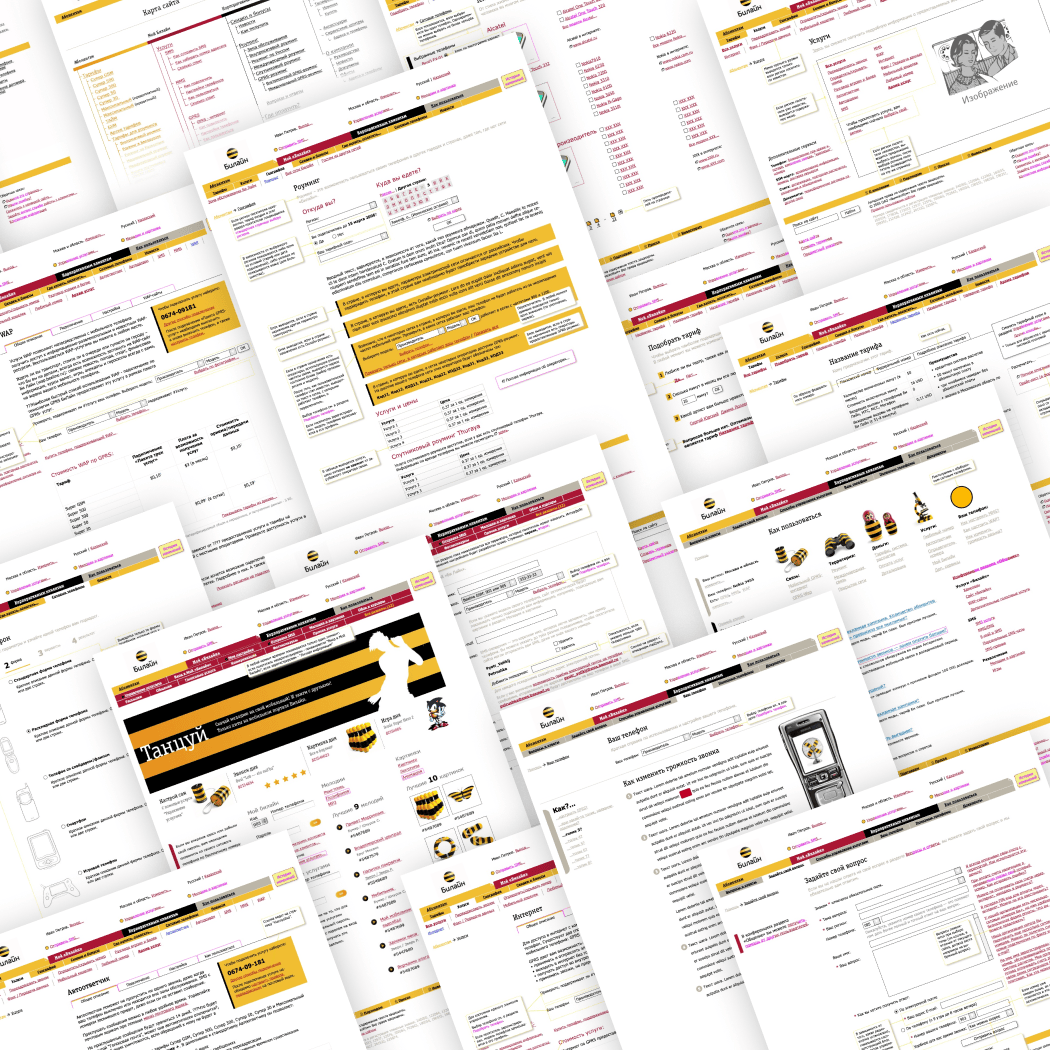
Beeline
2004
Beeline, Russia’s first mobile operator, was gearing up for a rebrand and needed a new website — fast — to shift focus from voice to internet services (this was still the pre-smartphone era). Internally, it was a tangle of competing interests. Voice, VAS, internet, corporate — each pulling in a different direction, none particularly happy. A clean restart was the only option.
This was early web, so the toolbox was limited: no real dynamics, just what browsers could handle at the time (think expanding menus and not much else). To make things more interesting, the new visual identity was under wraps until late in the project, so I had to design most of the system blind.
The real work ended up being less about pixels and more about people — interviewing stakeholders, navigating feasibility constraints, and iterating prototypes over and over as new input came in. Eventually, I myself became the neutral party who decided what made it into the site and what didn’t — as everybody had seen that I had no stake in the internal politics.
Even early usability tests made the outcome clear: the new site outperformed both the old one and competitors across the board.
The project turned out to be a turning point — later on, I ended up art directing interfaces for both of Beeline’s main competitors, plus a range of VAS products and subscriber apps for Megafon.
© Vlad Golovach, 1999-2026. ¶ Trademarks shown on this site belong to their respective owners. ¶ Set in Vollkorn & Gill Sans.